This is the first time I'm playing along with the
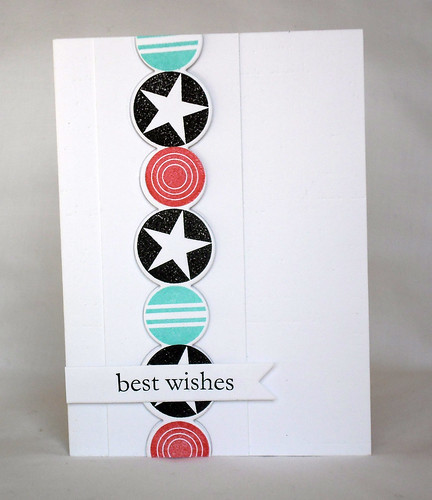
Card Concept Challenge. Not sure what my style is...thought it was CAS, but after reading through the definitions of the styles I think this card is more Clean and Graphic.

The front of the card base has been embossed with PTI's Linen impression plate, for some texture and the circle panel
has been stuck on with foam dots for dimension.

Absolutely clean and graphic! I love the way the colors pop against the white background and those circles are very graphic. Great design on your card too! Glad you have discovered the Card Concept Challenge!
ReplyDeleteWhat a handsome card! The line of circles makes such a bold statement.
ReplyDeleteThanks for joining us at The Card Concept!
Stunning card, Lee! Love the circles - they are really sharp and look great in this colour combo!
ReplyDeleteLove this clean and graphic design! Thank you so much for sharing with us at the Card Concept!
ReplyDelete